Your Cart is Empty
Spend an extra
£40.00
for free UK delivery

One great thing about starting a new business is the clean slate. As the creator, you get to decide exactly what you want to create without interference. The beginning is an exciting place to start.
Finding ourselves in this position, we’ve chosen not to take it lightly and set out to do everything with intention. In fact, this ethos is in everything we do as our tagline ‘Solid skincare with intention’ suggests.
We are making sure we work with the right people, those who believe in what we’re doing. That means we’re formulating and manufacturing the products in the right way. And of course, designing the brand, products and packaging we are truly proud of.
It’s this last point that we wanted to share more about.
Our intentional design decisions have already been numerous and significant. We knew we wanted the brand look to feel graphical and strong, without being overly masculine in appearance.
Most importantly we wanted the design to reflect what’s inside…
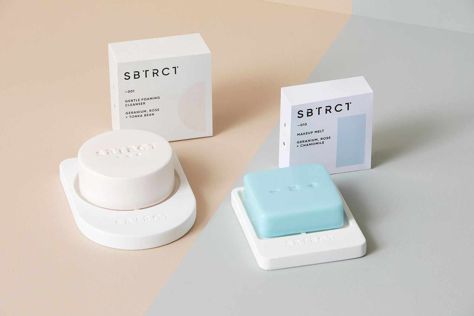
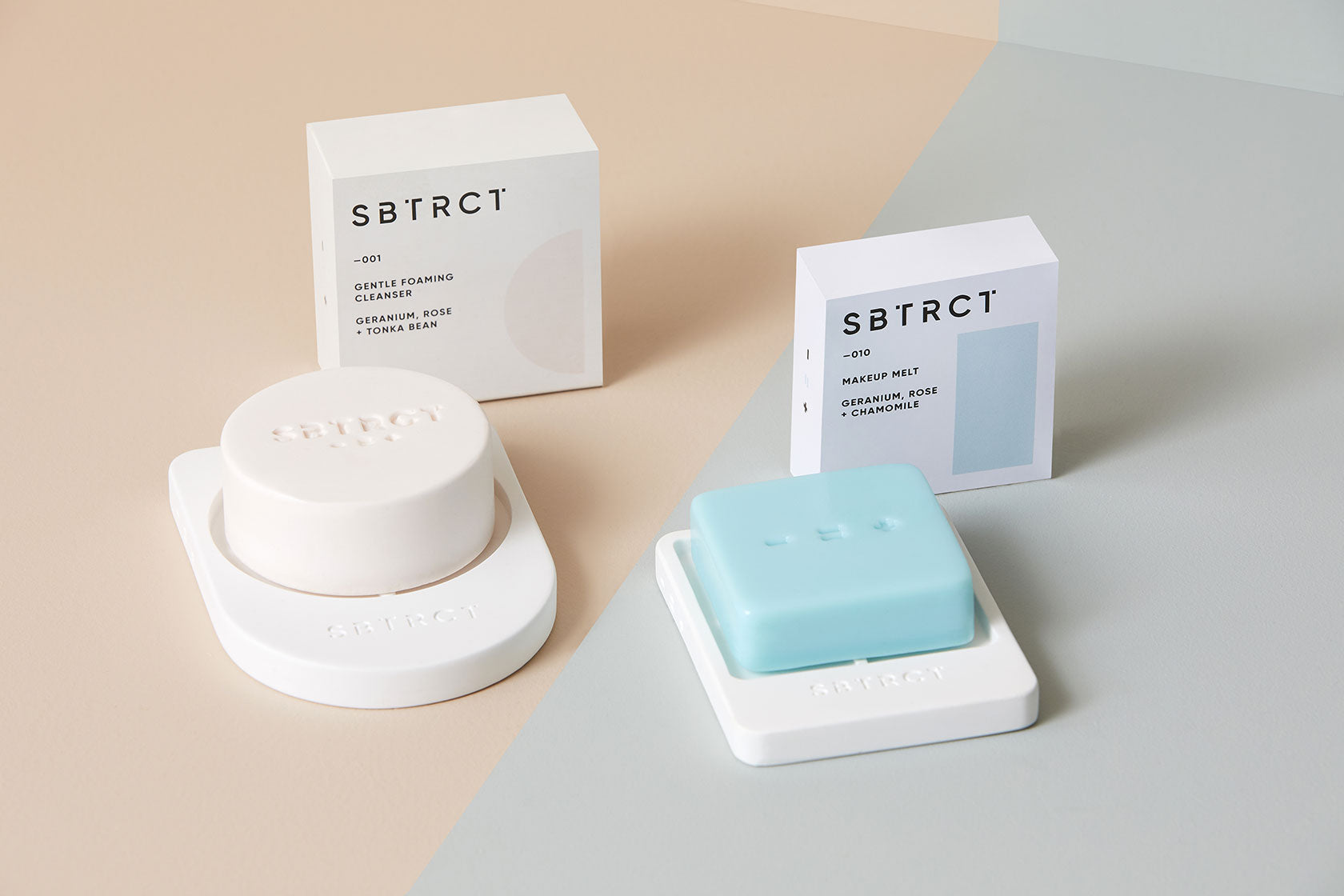
Colours and Shapes
Naturally colour is a big part of the SBTRCT brand identity. When creating a gender-neutral brand, the use of colour is crucial. It also plays a significant part in helping the customer navigate the choice between products.
We settled on a palette of pastels broad enough to appeal to all and light enough to soften an otherwise quite masculine aesthetic.
The use of geometric shapes was another choice that, like the colour, we’re excited will become more important and integral to the brand aesthetic as the range grows. Our intention is that different shapes represent different product verticals (circle for skin, square for hair etc.)

[Some early concepts from our friends at WDC Studio]
Icons
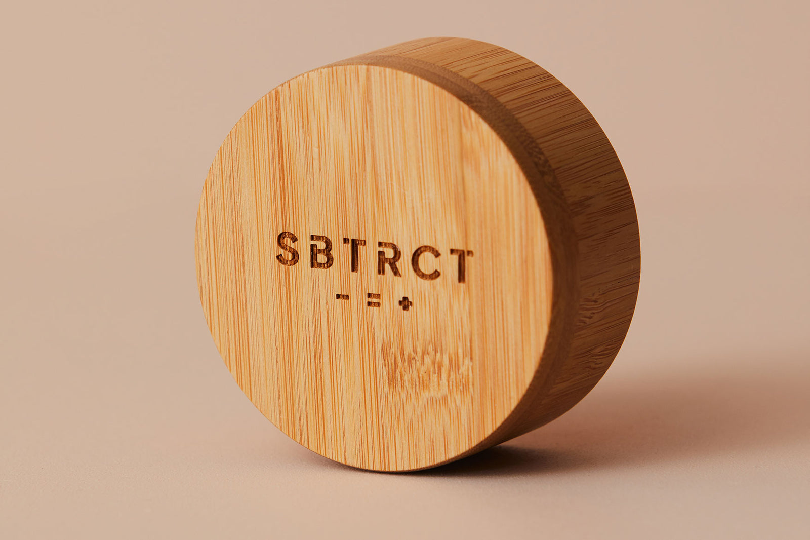
The - = + icons which reflect our “less is more” ethos are another visual device we’ve introduced. Although intended, this was one decision that we stumbled across by chance. As we looked for inspiration for the brand, our founder was flicking through Factory Records: The Complete Graphic Album (a must-have for any design geeks btw). Jan van Munster’s "+ -" featured on Joy Divisions Atmosphere artwork was striking and jumped off the page. An adaptation of this idea made for the perfect interpretation of our “less is more” ethos.

[Jan van Munster’s "+ -" featured on Joy Divisions Atmosphere artwork]
Fonts
The topic of fonts allows us to mention another book, Just My Type by Simon Garfield. The importance of fonts in branding cannot be underestimated and the opportunity to choose our own excited us. For the packaging, we went with something bold, but graphical. Gilroy is a modern sans serif with a geometric touch, perfectly suited for graphic design. We felt this would work well with the shapes on-pack and the overall look we were trying to achieve.
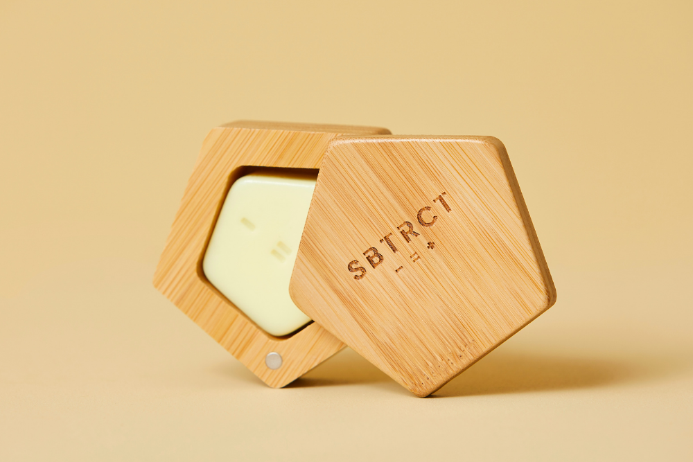
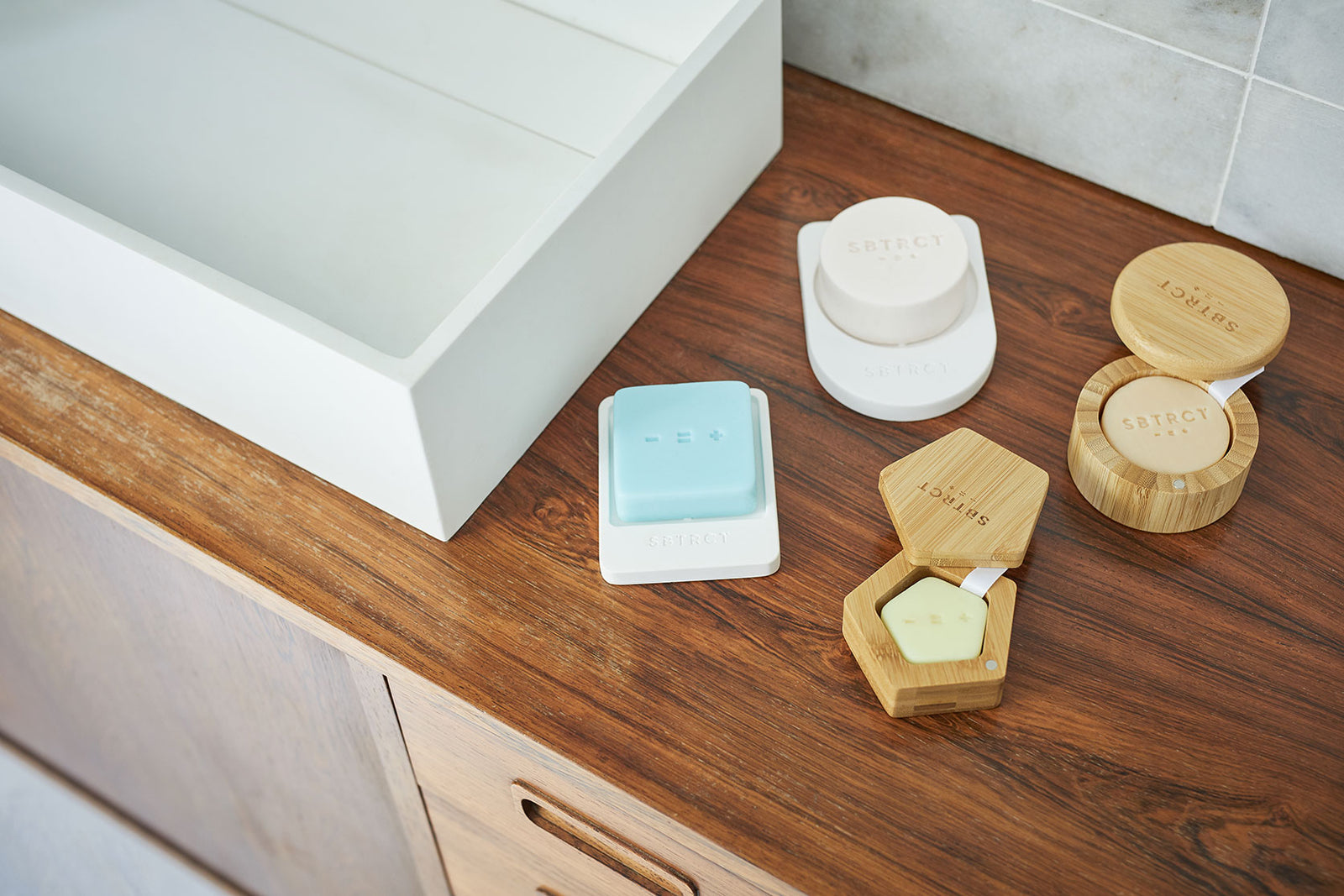
Materials
One of the longest and most interesting journey’s we’ve been on since starting SBTRCT is when selecting the materials we chose to work with. Whether it be our cleanser dish, made from fossilised algae, our bamboo pot, or our 100% domestically compostable cartons.
The opportunity to learn and make decisions that we feel help ensure our brand is both ethical and environmentally friendly in its approach has been one of the most rewarding and educating.
At SBTRCT we strive to make products that look beautiful. We design with intention - practically and aesthetically. The bathroom is an incredible space in your home. A place you go to change your state. Whether it’s to wake up in the morning, or a place to relax in the evening, wash away the stress of the day.
We appreciate this and we share your desire to keep bathrooms looking beautiful. Like our business, our design ethos is less is more. We love understated beauty and our taste is minimalist. We try to create products that reflect this.
If you have any questions, suggestions or advice we’d love to hear from you.